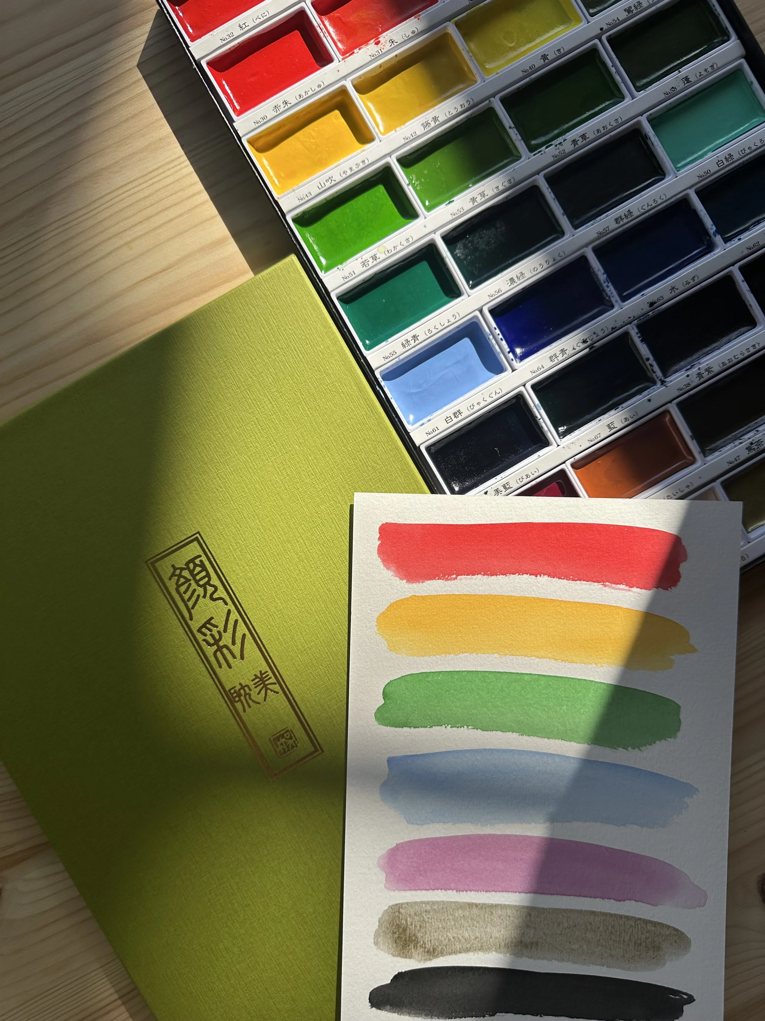
Japanese Gansai Tambi Kuretake Watercolour Paints
After experimenting with countless watercolour brands over the years, I’ve completely fallen in love with the Gansai Tambi Kuretake set.
If you’ve ever opened a box of these paints, you’ll know there’s something truly special about them. Each colour sits in a deep, generous rectangular pan, and the moment your brush touches the surface, the paint melts into a buttery, highly pigmented wash that feels unlike any watercolour palette I’ve tried.
Although often described as Japanese watercolours, Gansai Tambi really sit somewhere between traditional watercolour and gouache. They have that signature Japanese richness and opacity, but can still be thinned down beautifully for light, delicate washes.
My first impression? The pan size.
After so many palettes with tiny little wells, seeing such large pans felt like a dream. The only downside is that the palette isn’t the most portable - it’s not the type you can just pop into your bag for painting on the go. However, the pans can easily be removed if you want to take a few favourite colours out with you.
Now, onto the paints themselves. Wow.
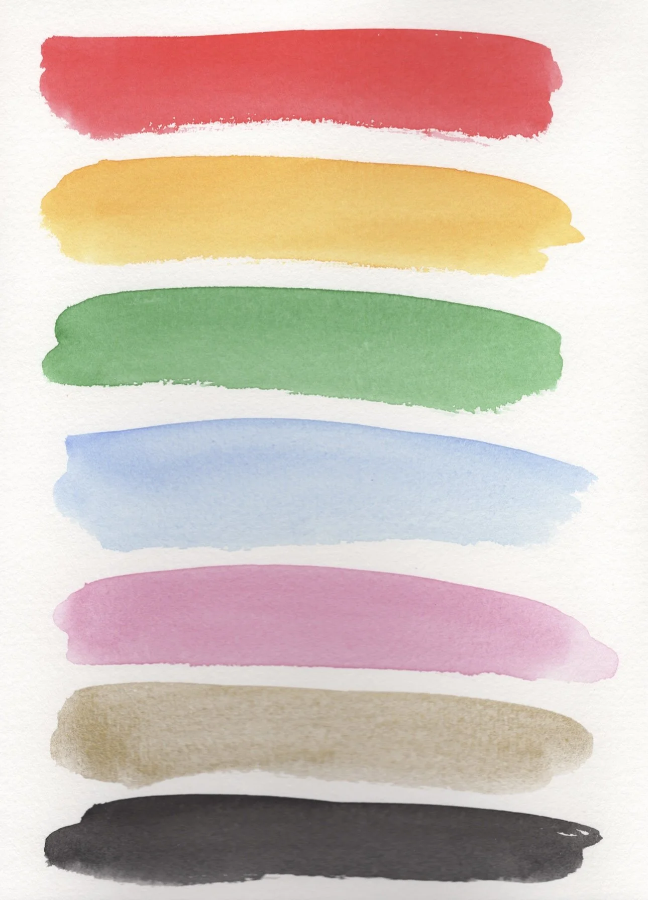
I’ve used paints before that dried to a dusty or chalky finish, but these are completely different. They’re rich, creamy, and vibrant, leaving a luminous, slightly glossy finish once dry.
They’re also incredibly buildable, giving you wonderful control over your painting - from delicate, translucent layers to bold, saturated colour. Their creamy consistency and quick re-wetting ability make them perfect for both beginners and professionals.
The colour range is stunning, with shades that feel both traditional and modern - from soft neutrals to jewel-like metallics. Each pigment seems to hold its own character and depth, making mixing and layering a joy rather than a challenge.
I typically paint on textured 320gsm watercolour paper - something I highly recommend to stop the paper from buckling or pilling up - and these paints glide across it beautifully, holding their colour and vibrancy even after multiple layers.
One of my personal favourites is the deep cobalt blue - it’s incredibly smooth and vibrant, and I’ve used it heavily in my Koi fish painting. It captures that perfect balance of fluidity and richness that I’m always chasing in watercolour.
If you’re looking for a set that offers both the soft elegance of watercolour and the striking opacity of gouache, I recommend Gansai Tambi as they are truly a joy to paint with.